
About the author
Anton Slashcev
10 years in Product Management, Business Strategy & Narrative Design. Consulting in Match-3, Casual Narrative & Hybrid-casual market.
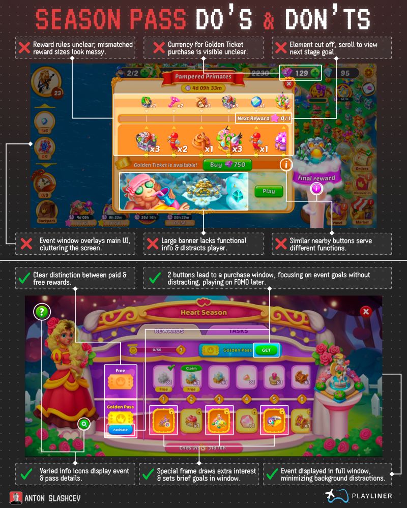
❌ 𝗪𝗵𝗮𝘁 𝘁𝗼 𝗮𝘃𝗼𝗶𝗱:
• Unclear reward rules and mismatched item sizes = visual mess
• Currency for premium pass purchase isn’t labeled clearly
• Elements are cut off, players need to scroll to see key info
• Main event window overlays core game UI (clutter alert)
• Huge banners distract instead of inform
• Similar buttons serve different functions (confusing!)
✅ 𝗪𝗵𝗮𝘁 𝘁𝗼 𝗱𝗼 𝗶𝗻𝘀𝘁𝗲𝗮𝗱:
• Visibly separate free and paid rewards
• Two buttons → same goal: purchase window (without distraction)
• Use icon variety to signal event structure and pass benefits
• Highlight goals with a special frame—sets expectations
• Display event in full window to avoid background clutter
The best Season Passes balance:
→ Clarity
→ Motivation
→ Minimal distractions
Design with purpose.
Reward with intention.
Your players will thank you for it.
Please login or subscribe to continue.
No account? Register | Lost password
✖Are you sure you want to cancel your subscription? You will lose your Premium access and stored playlists.
✖