

Game Shop best practices in UNO! from Mattel
Game Shop best practices in UNO! from Mattel, Inc.
As I’m writing the book on Game Shops in f2p mobile games, I check many top games for best practices. And for bad ones, too.
Let’s see today, how many of them are presented in UNO’s game shop:
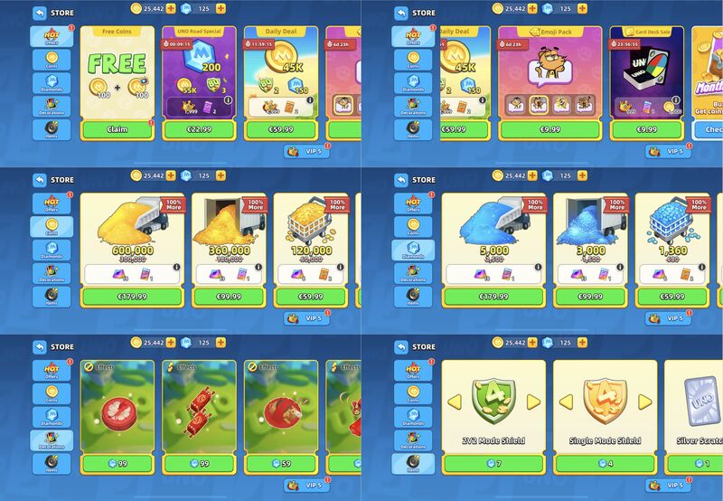
✅ Shop is clearly divided into sections by tabs. It has so many items, that making a general list would make it feel infinite.
✅ Red bubble notification markers drag attention to important news. Like that it’s time to claim free gift.
✅ Slots have titles for bundles, clear bright images, only essential texts. It is very easy to read.
✅ Time-limited offers are clearly indicated by label with timer.
✅ Content is animated, which is also visually appealing and raises perceived value.
✅ Currency counters are shown at the top, for easy checking current balance.
✅ (i) buttons for getting additional information about lootboxes (card packs in this case).
✅ Currency packs icons are visually showing volume progression.
✅ First purchase bonus is there, with clear label and old/new amounts shown for comparison.
✅ Two slot sizes, small and big. To fit different amount of content. Clever used big slot for the biggest currency packs (even if it is not actually needed to fit the content, just for extra impression).
✅ Interesting choice for the items of the same category – shields, but different price scale (the last screen). Big slot is used to show arrows. Players can tap arrows to scroll to the required item, and the price will change accordingly. So they don’t have to make 4-5 similar looking slots.
✅ VIP status is highlighted, because it can give extra discount for the shop. It the player forgot to claim it, they can do it from here.
✅ Slots sorting strategy – from high to low prices. Clearly for whales. Starting from $180 gives that away immediately.
But what’s bad?
❌ It is simply called “Store”, which is as if it wasn’t named at all. No difference. Clearly, players would not be lost without it.
❌ Despite it’s structure, there are so many items even on a single page, that sometimes it’s hard to digest.
❌ Slot sizes are so big, that in some cases only 2 slots fully fit into the screen.
❌ For bundles sorting is different and not clear. They are sorted by urgency – the less time left, the close to the beginning of the list. But then it changes for another two slots. And the Free item is always first.
What do you think? Could they do better?
I believe mini-version would come handy. But I honestly don’t remember if they have it – I play for many years, and I’m paying as well.